
Timeline
February 2023 (2 weeks)
My Role
Solo student responsive web project for Academy Jungle UX/UI designer bootcamp
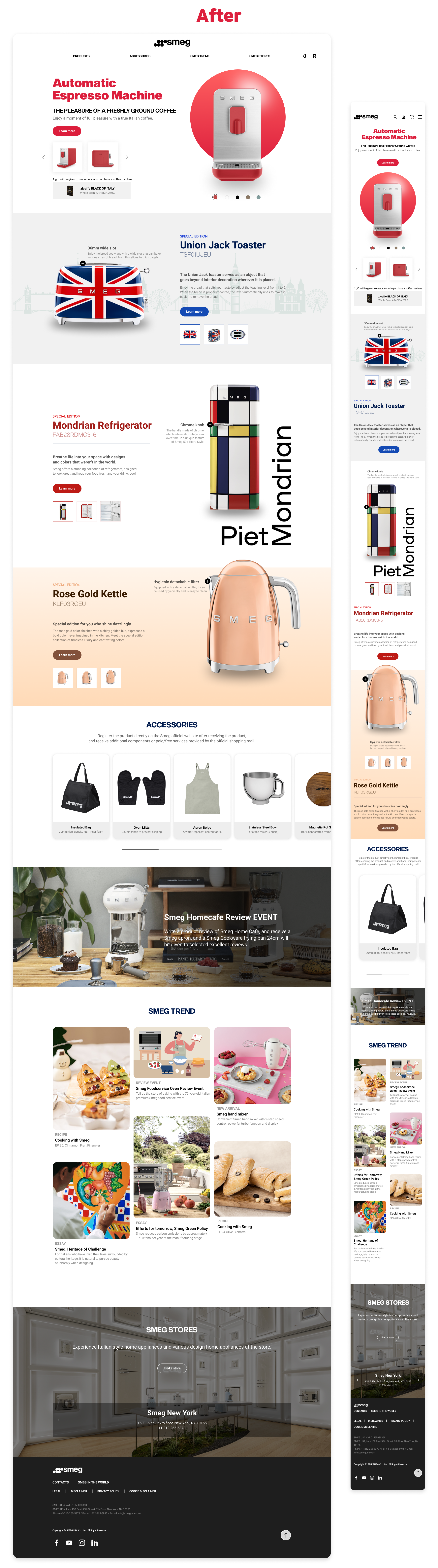
OVERVIEWRedesigning Italian home appliances brand, Smeg’s official website based on UX thinking
I redesigned Smeg’s responsive website using UX thinking. The goal of the project was to provide a consistent user experience across all devices, from desktop computers to smartphones.
PROBLEMIt is hard to find COLLABORATION products on the main page
Smeg is unique in that it has a variety of collaboration products with other brands, but the existing website doesn't seem to show this well. I redesigned the website to highlight these collaborations and make them more accessible to users.

Three solution
I created a new section dedicated to collaborations. This section features images of Smeg's products with other brands at the top of the homepage.
I included short descriptions of each collaboration, highlighting the unique features of the products.
I linked to more information about each collaboration on the website.
HIERARCHYI used a variety of techniques to create a clear HIERARCHY on the website
Using different font sizes and weights to indicate the relative importance of different pieces of content.
Using whitespace to separate different sections of content and make them easier to scan.
Using clear and concise language that is easy to understand.
Organizing the content in a logical way that follows a natural order.
RESPONSIVE WEBSITEI changed the screen from desktop to mobile considering:
Screen size:
The screen size of a mobile device is much smaller than a desktop computer, so I made sure that the content is still readable and usable on a smaller screen.
Input methods:
Mobile devices typically use touch screens, so I made sure that UI is designed for touch input. This means using large, easy-to-tap buttons and avoiding small text or fine details.Content prioritization:
I decided what's most important for users to see and made sure that's the content that's most visible.Navigation:
I made the navigation is easy to use on a mobile device by using large, clear buttons and avoiding complex menus.
THE STYLE GUIDE
REFLECTION✨ More visually appealing, informative and accessible to users
I believe that these changes make the collaborations section of the website more visually appealing, informative and accessible to users. This will help Smeg to better showcase its collaborations and attract new customers.
Thanks for reading 🙂