Timeline
January – March 2023 (8 weeks)
My Role
UX research, UI design, usability testing
Team
Side project - June Kim (Designer), Seoin Kim (SW Engineer)
OVERVIEW
Launching a responsive website that streamlines travel planning, achieving 688% increase in views
We undertook a project designed to create a responsive website “Travel Fun". After eight weeks of work, we were selected as the top 10 teams out of 26 and presented the project on a demo day. Through our efforts, we provided users with a platform to lower their stress and start the trip with a light heart and excitement.
PROBLEM
The process of preparing for a trip becomes intimidating
I travel a lot and I love it, but I really don't like the process of preparing for the trip. From viewing information about travel destinations, packing luggage without missing anything, to arriving at the airport on time, the experience easily becomes intimidating.
This sparked the question — why can’t we start the trip with a light heart and excitement?
THE SOLUTION
Make your travel fun from the Moment You Start Planning!
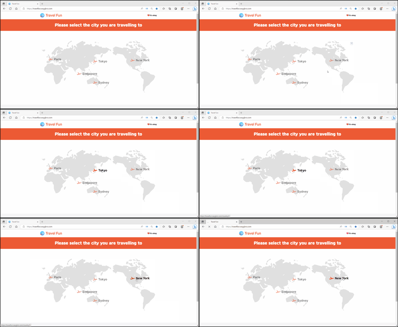
STEP 1. Choosing a city you are visiting
You can choose a city they are visiting among 5 world cities.
STEP 2. Learning about your destination
You can get the necessary information to visit the city at a glance, such as visa, exchange rates, voltages, etc.
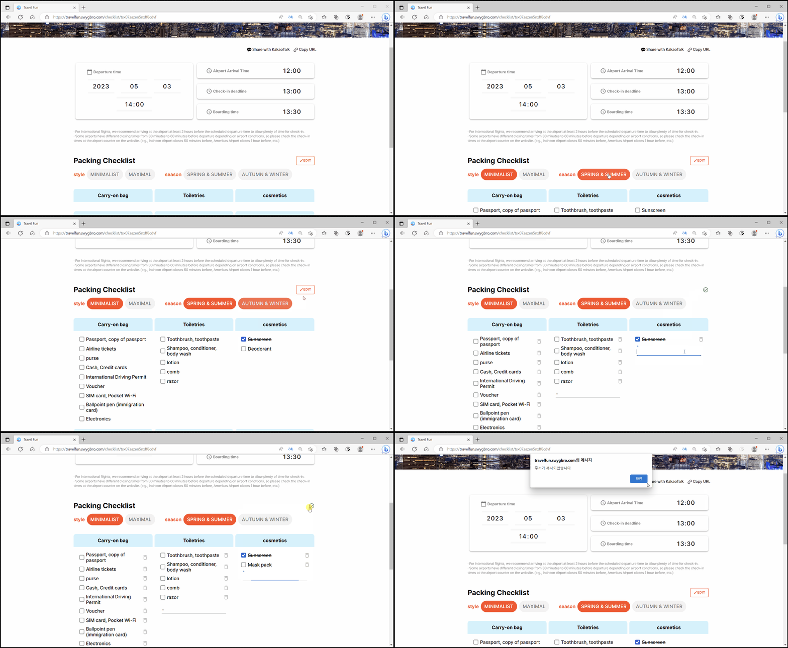
STEP 3. Filling out your Flight Time and Pre-selected Packing List
You enter their flight departure time and the website shows their own three important times: expected airport arrival, check-in closing, boarding time. By choosing the style and season, users can use a pre-selected customized packing list, and save or share the URL.
STEP 4. Exploring travel content
You can check out information about their destination including attractions, restaurants, and history, etc.
USER SCENARIO
Emma, an impulsive traveler, is heading to New York and needs to make plans
Through user scenario, I found out what wow moment users can get through our website and a wide range of opportunities for them.
🎯 Opportunities
Showing their own schedule: expected airport arrival time, check-in closing time, and boarding time
A section to check what to pack in the luggage
Providing various travel contents such as restaurants, shopping, must-go places, etc.
DISCUSSION WITH A SOFTWARE ENGINEER + COMPETITIVE ANALYSIS
A website dedicated to streamlining travel preparations
I’m passionate about travel, which inspired me to collaborate with a software engineer to brainstorm ideas using post-it notes. Initially, I proposed showcasing restaurants near tourist attractions by distance, but after research and feedback, we shifted focus to addressing travelers’ needs before their trips—creating solutions beyond existing tools for planning, reviews, and schedules.
RESEARCH
THREE BIG ISSUES you can confront before starting your trip
From a survey of 20 travelers, I found out that there are three challenges travelers may face before starting their journey. Participants were aged from 23 years old to 64 years old. Most people have been worried that they might miss a flight, leave necessary items, and not find enough travel information.
USER FLOW
I designed a seamless user flow that guides users through a step-by-step travel preparation process
DESIGN PROCESS
I sorted them into steps that showed a smooth flow so that first-time users could intuitively understand
PAPER PROTOTYPE
First, I drew a paper prototype and constructed a rough website function.
WIREFRAMES
I made a wire frame based on paper prototype. Since our project had to be completed in eight weeks, I showed it to the software engineer to communicate how long it would take to create this feature and whether we could create all the features in eight weeks.
PRESENTATION + USABILITY TEST
Users liked the Pre-selected Packing List feature, but there are two things to be improved, so we iterated once more
Our project was selected as one of the top 10 teams and showcased on demo day, with users praising the intuitive interface and pre-selected packing list feature, organized into six categories including a separate carry-on bag section. Based on user feedback, I improved the design by adding an "Edit" button next to the pencil icon for better visibility and introduced a style-and-season customization option to create a more personalized checklist.
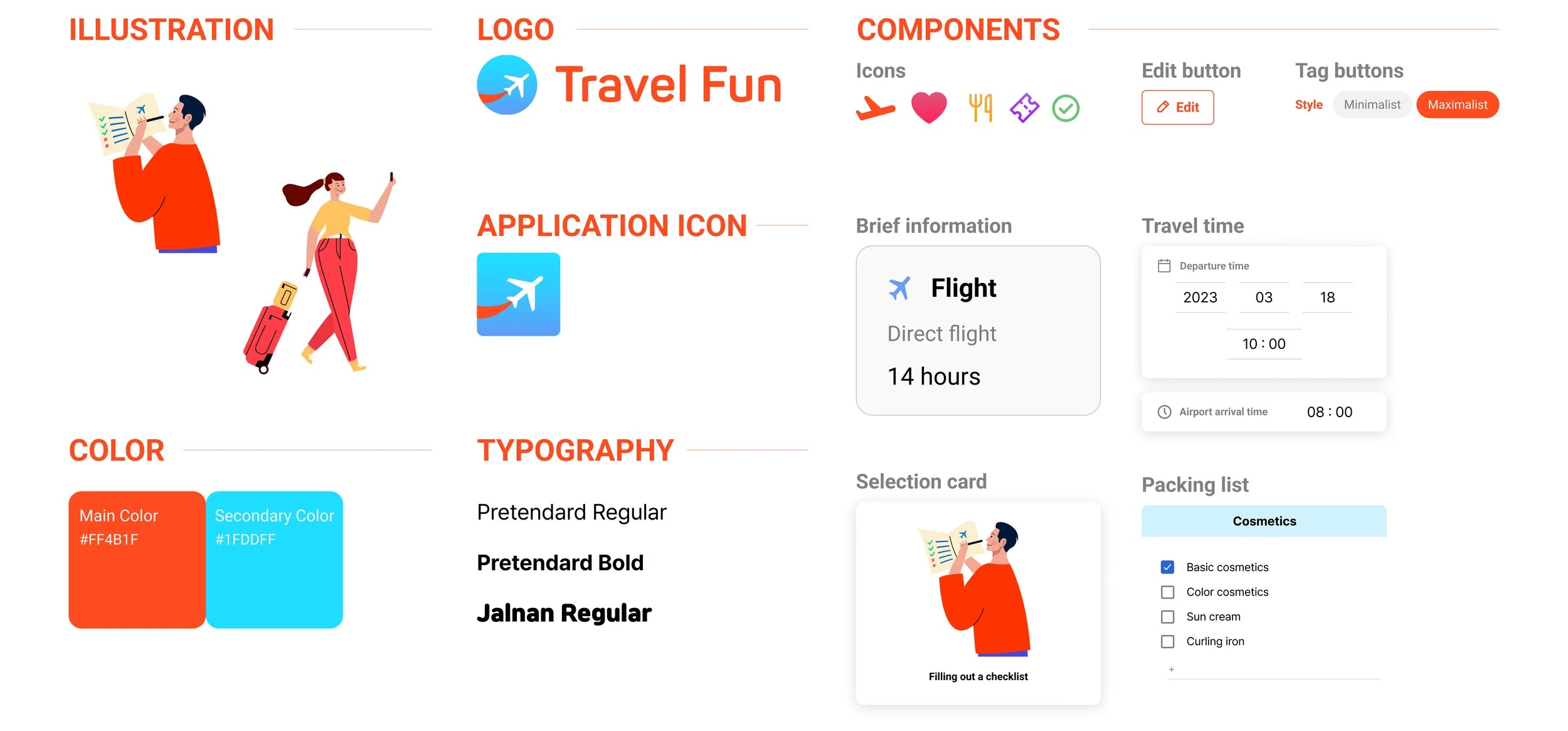
THE STYLE GUIDE
NORTH STAR
Adding more features for even better Travel Preparation
If time allowed, I would have (1) added real-time airport security wait times and (2) integrated travel-related ads alongside the 'Packing Checklist.' This would streamline user convenience and enable quick purchases for essential items.


